

Cursor Types Explained: What Every Pointer Shape Means
Cursor types are the different pointer shapes your computer shows as you move across a screen: arrow, hand, text bar, busy wheel and more. This guide lists each one, what it means, and the CSS value that websites use to ask for it.
Cursor or pointer: what is the difference?
In everyday talk, "cursor", "mouse pointer" and "pointer" all mean the small image that follows your mouse. Strictly, a cursor is the on-screen marker for where input happens, and a pointer is the marker your mouse moves. Most people use the words as one.
The CSS language adds a twist. It has a property called cursor, and one of its values is called pointer. That value does not mean "any pointer". It means the shape used over links, usually a hand.
The shape changes to tell you what a click, a drag or a typed key will do. A quick glance at the cursor is a small hint from the interface, and it works without any words.
Table of common cursor shapes
The table below follows the CSS cursor keywords documented by MDN. The exact picture depends on your operating system and browser, so the "Shape" column describes the typical look.
| Shape | Name | Where you see it | CSS value |
|---|---|---|---|
| Arrow | Default | Empty areas of a page, most of the desktop | cursor: default |
| Pointing hand | Link pointer | Over links and clickable items | cursor: pointer |
| Thin vertical bar (I-beam) | Text | Over text you can select or edit | cursor: text |
| Hourglass, watch or spinner | Wait | The program is busy and you cannot use the interface | cursor: wait |
| Arrow with a small spinner | Progress | The program is busy, but you can still use it | cursor: progress |
| Thin cross | Crosshair | Picking a spot, such as in image or drawing tools | cursor: crosshair |
| Four-way arrows | Move | Over something that can be moved | cursor: move |
| Open hand | Grab | Over an item you can drag, such as a map | cursor: grab |
| Closed hand | Grabbing | While you are dragging that item | cursor: grabbing |
| Circle with a slash | Not allowed | Over a disabled button or a forbidden drop | cursor: not-allowed |
| Arrow with a question mark | Help | Over items that have help information | cursor: help |
| Magnifier with a plus | Zoom in | Over an image you can enlarge | cursor: zoom-in |
| Magnifier with a minus | Zoom out | Over an image you can shrink | cursor: zoom-out |
| Left-right arrow | Horizontal resize | On the left or right edge of a resizable box | cursor: ew-resize |
| Up-down arrow | Vertical resize | On the top or bottom edge of a resizable box | cursor: ns-resize |
| Diagonal arrow, top-right to bottom-left | Diagonal resize | On two of the four corners of a window or box | cursor: nesw-resize |
| Diagonal arrow, top-left to bottom-right | Diagonal resize | On the other two corners | cursor: nwse-resize |
| Left-right arrows with a bar | Column resize | On a column border in a table | cursor: col-resize |
| Up-down arrows with a bar | Row resize | On a row border in a table | cursor: row-resize |
| Thick cross | Cell | Selecting table or spreadsheet cells | cursor: cell |
| Arrow with a small menu | Context menu | When a context menu is available | cursor: context-menu |
Busy cursors: wait versus progress
These two are easy to mix up. According to MDN, wait means the program is busy and you cannot interact with the interface. progress means it is busy in the background, but you can still interact.
The picture also varies by system. MDN notes that wait is sometimes an hourglass or a watch. On a modern system you may see a ring or wheel that spins instead.
Hand versus arrow
The arrow says "I am pointing at the page". The hand says "this thing is a link". Designers rely on that change so you know where to click before you click.
The open and closed hands are a different pair. They belong to dragging: open means you can grab, closed means you are holding.
Other values worth knowing
- copy: something is to be copied.
- alias: a shortcut or alias is to be created.
- no-drop: an item may not be dropped here.
- all-scroll: you can scroll in any direction.
- vertical-text: vertical text can be selected.
- auto: the browser picks the shape from the context.
What is a hotspot?
Cursor vs pointer on ILOVE-CURSOR
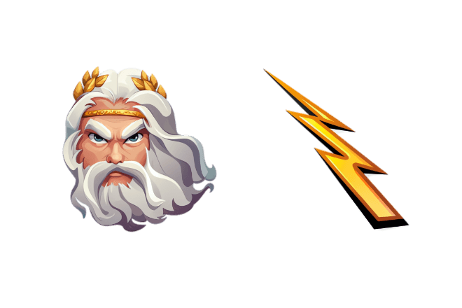
Every design on ILOVE-CURSOR is made of two images. The cursor image is the normal state, shown over empty space and text. The pointer image is shown when you hover over links and buttons.
That mirrors the table above: the cursor replaces the default arrow, and the pointer replaces the link hand. Many designs make the two images a matched pair, such as a face for the cursor and an object it holds for the pointer.
Here is one example. The Zeus design pairs a bearded head with a lightning bolt, so you can compare the two states side by side.
You can browse more designs in the full collections list, or read how to use the extension.
Related reading: if a design does not show up where you expect it, see custom cursor not working: fixes. Chromebook users can start with changing the cursor on a Chromebook. For a softer style, try cute aesthetic cursors, or add some color with the Christmas cursors advent countdown.
 English
 Русский
 Українська
 Español
 Français
 Tiếng Việt
 Deutsch
 日本語
 中文
 Indonesia
 اردو